Ui/Ux Design | App Design | Brand Design
Serratura
Serratura
To start this project I questioned an interviewee about their bedtime routine and outlined their typical schedule. After this interview we discussed the pain points that they had in particular, staying off their phone in order to go to bed at a reasonable time. Taking this information I came up with the idea of Serratura, the bedtime lockdown app.
Serratura is an app that, once started, begins to systematically shut down your most popular apps. Games are the first to be locked once the process has started. Fifteen minutes later, all social media apps will lock and another fifteen minutes later, the process is complete after shutting down all entertainment apps. These apps won’t unlock until a predetermined wake up time. This wake up time can be changed whenever, but the change is not implemented for 12 hours so there is no way to cheat the system and unlock these apps earlier.
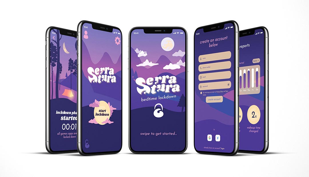
Once the idea was fully fleshed out, I went on to fully develop a persona, journey map, and organized the functionality of the app with a site map and each of the possible user flows. Before I started designing in figma, I took the time to do physical wireframes by hand and tested prototyping some of those flows. Below is the final product, but to see more about the steps I took to design the app and the process read further…
Protype via Figma
more flows available on desktop view…
Behind the Design
What better place to pull inspiration from than the beautiful mountains surrounding Boise (they are also extremely important to my interviewee, so it was only natural to include it in my design.) I wanted the entire app to have a calming and soft feel when going through it with an underlying warmth. All the good feelings you want when thinking about getting rest. This softness and comfort are shown throughout the app by the rolling mountains, puffy clouds, rounded edges, and of course the cozy little glowing tent.
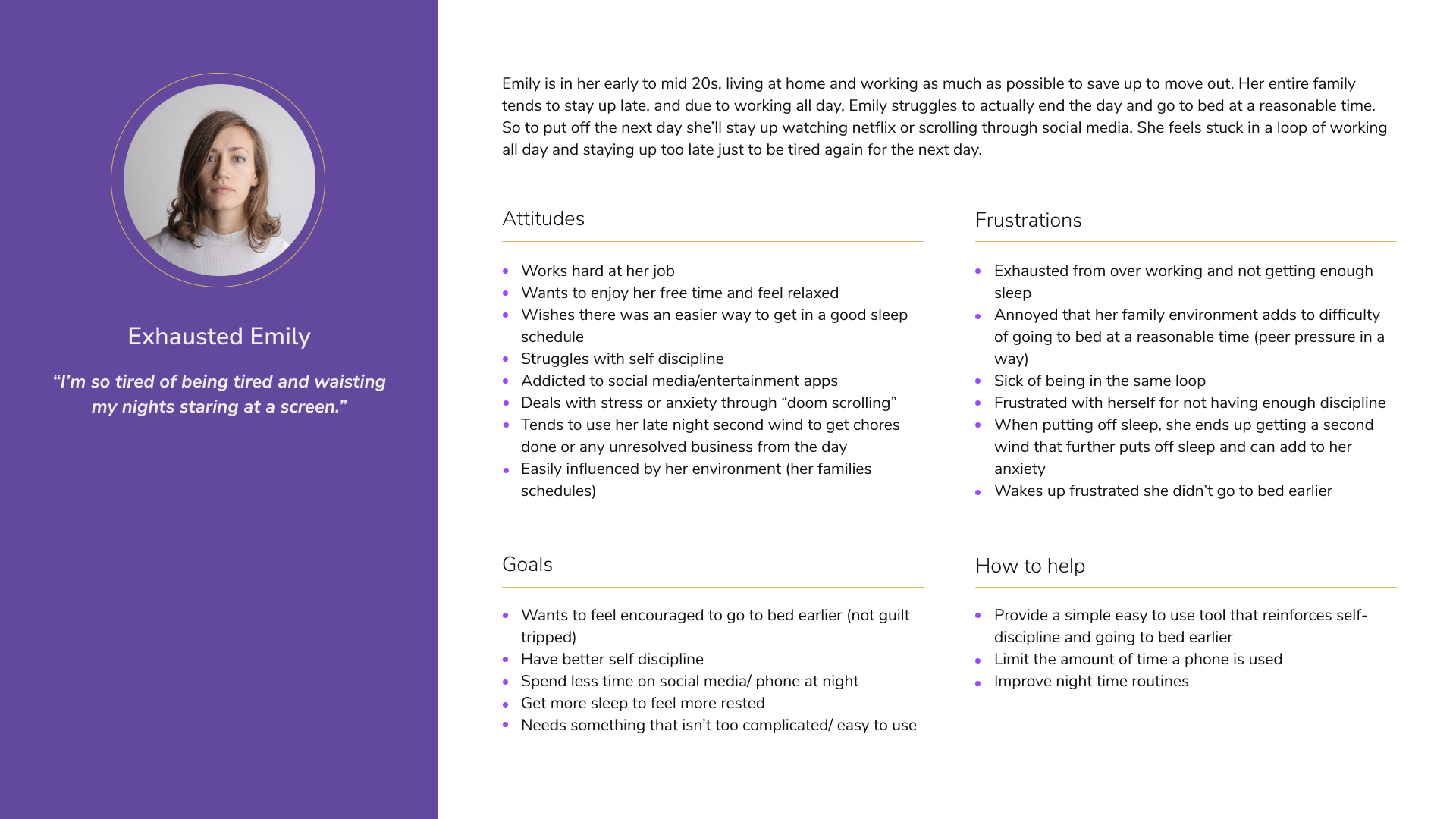
Persona & Journey Map
This is the start of the behind the scenes if you will of all the processes that happened before the design. As stated earlier, creating a persona was the crucial first step after the interview, and in turn helped determine what the user journey would be. All integral parts to UI/UX design.
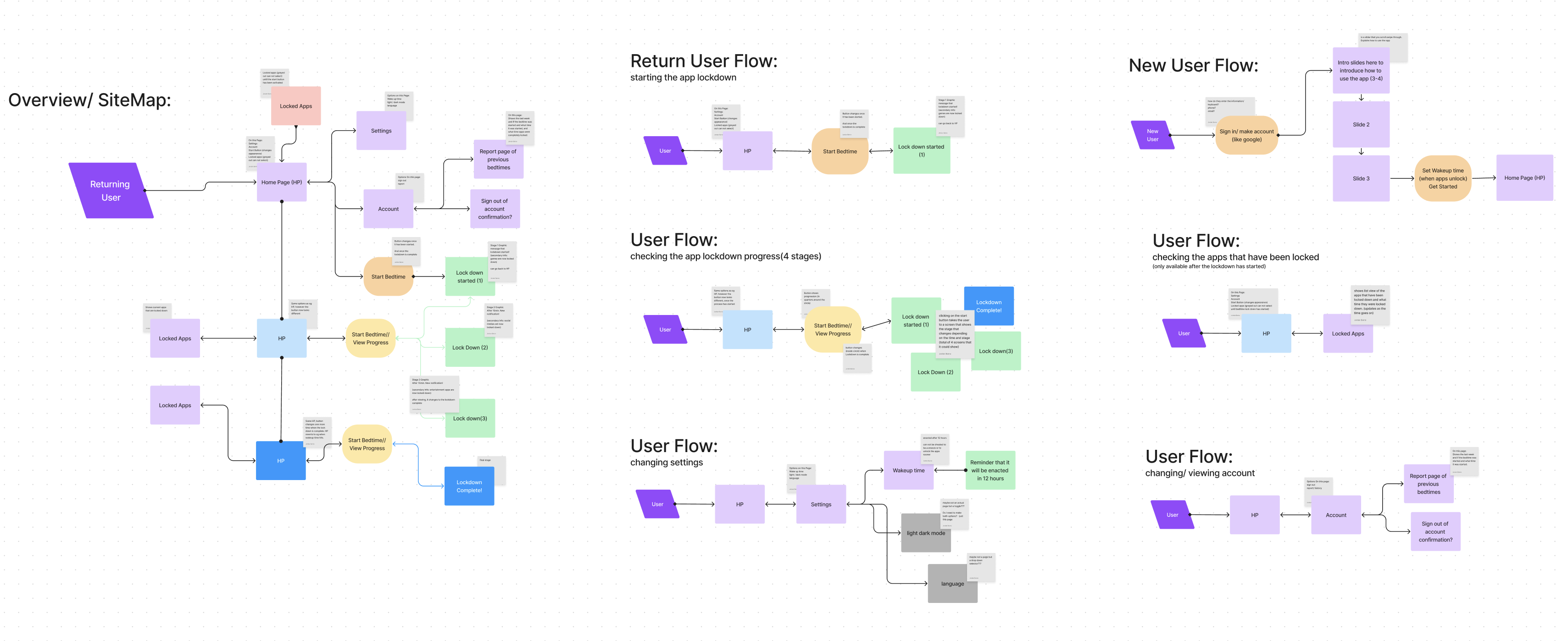
Site Map and Flow Charts
Once I had the target audience fully fleshed out and determined (ideally there would be more of course) it was time to plan out how the users would interact with this app and what the flow would be. I am a big believer in writing down notes for myself to stay organized and on track (I do love sticky notes) and that is what all the grey squares are, notes. On the left is the general overview of the entire app, and on the right I broke it down into specific flows for different user journeys.
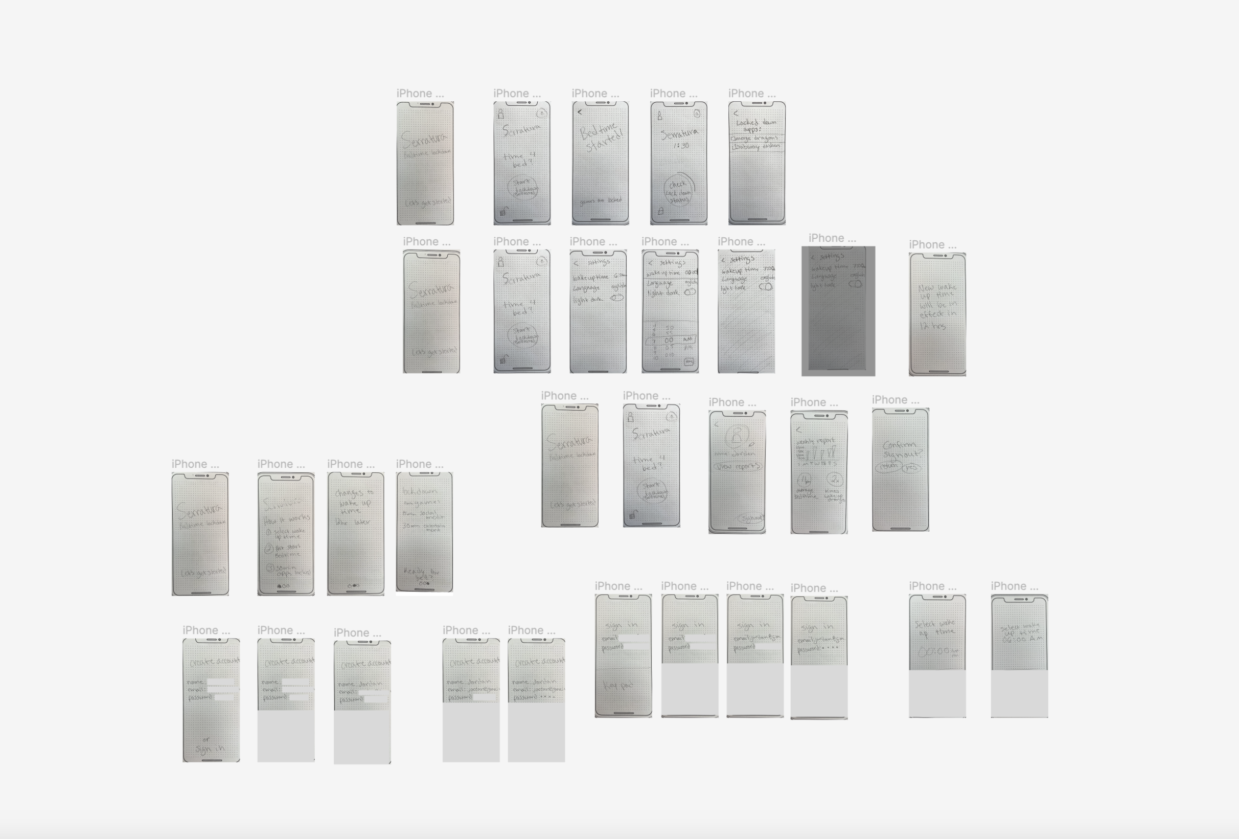
Paper Wireframes
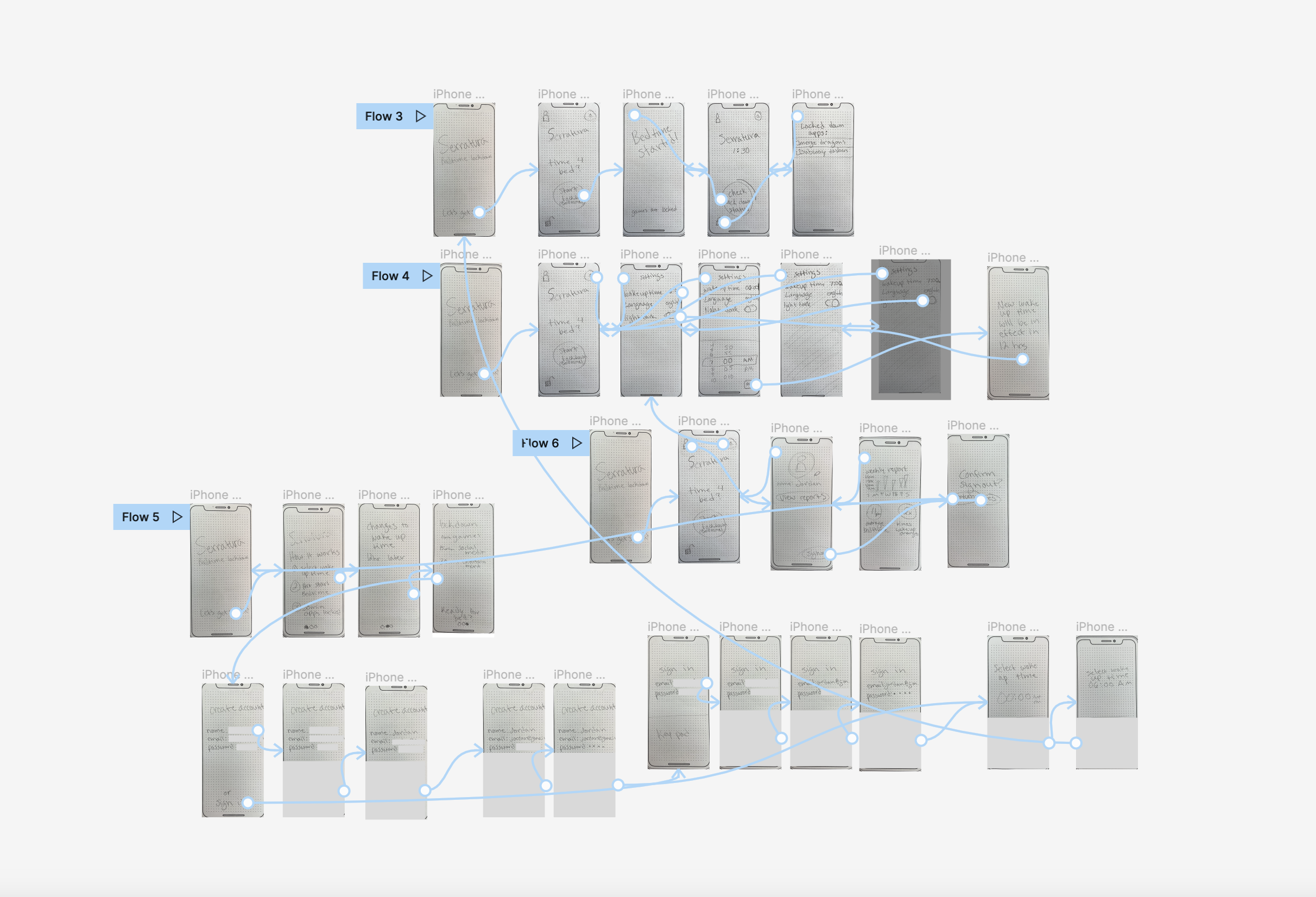
Before diving into the design, I worked on some physical wireframes for some of the flows and prototyped those in Figma. This really helped me understand how someone would move through this app and things to keep in mind.
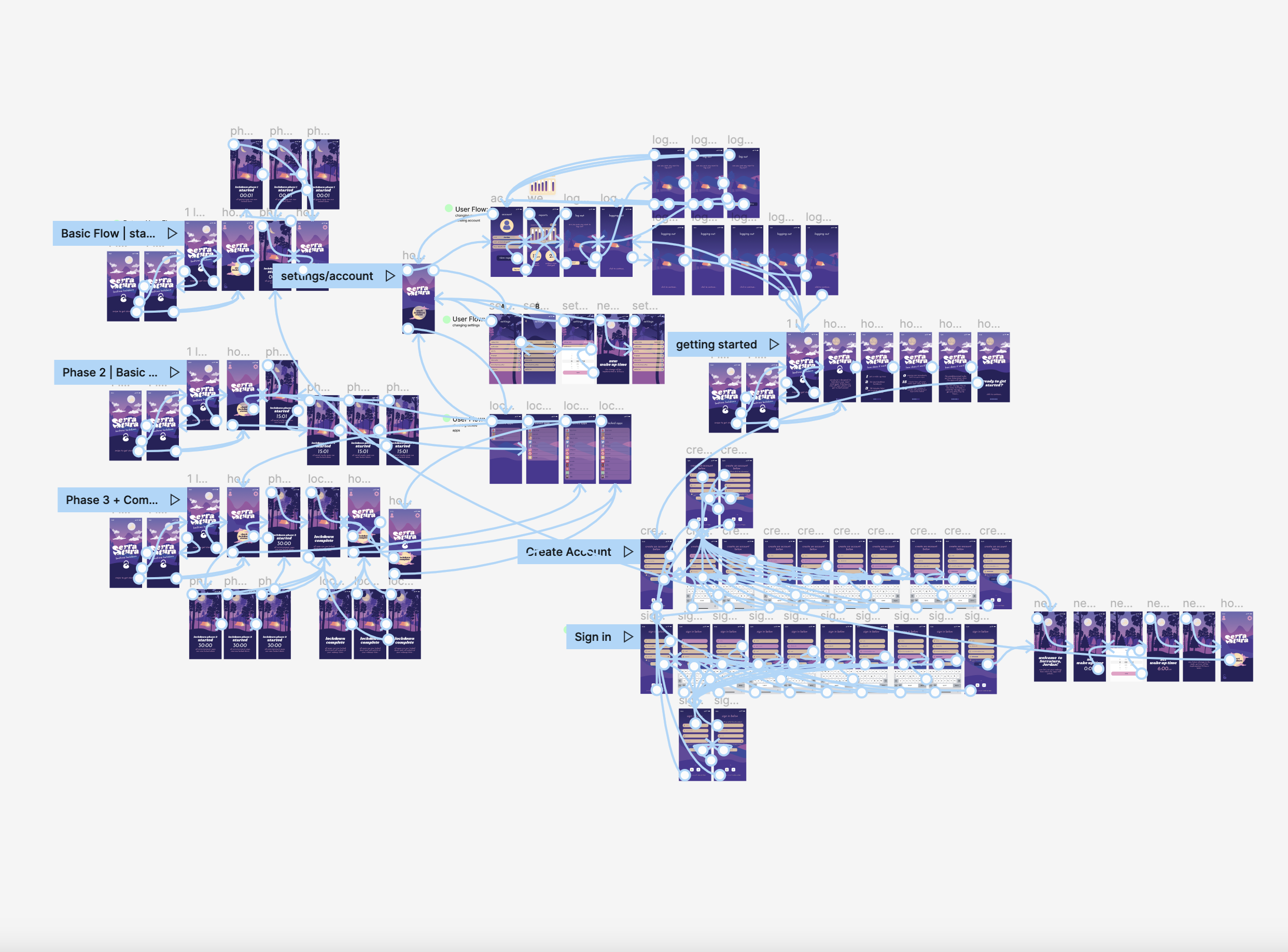
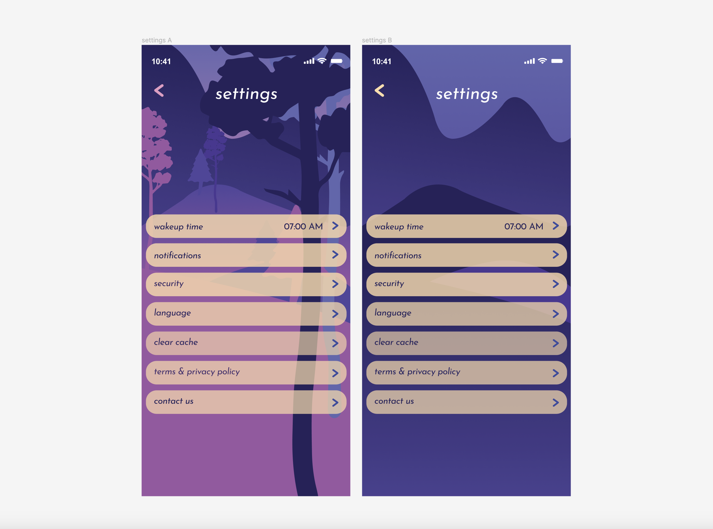
Below is a snapshot of all of the final flows, micro animations, and the possibility for A/B testing in the future. There is always room for growth, but I am very pleased with the lessons learned and the final product!

