Brand Design | Packaging Design | Print Design
Rochester Uncorked
Rochester Uncorked
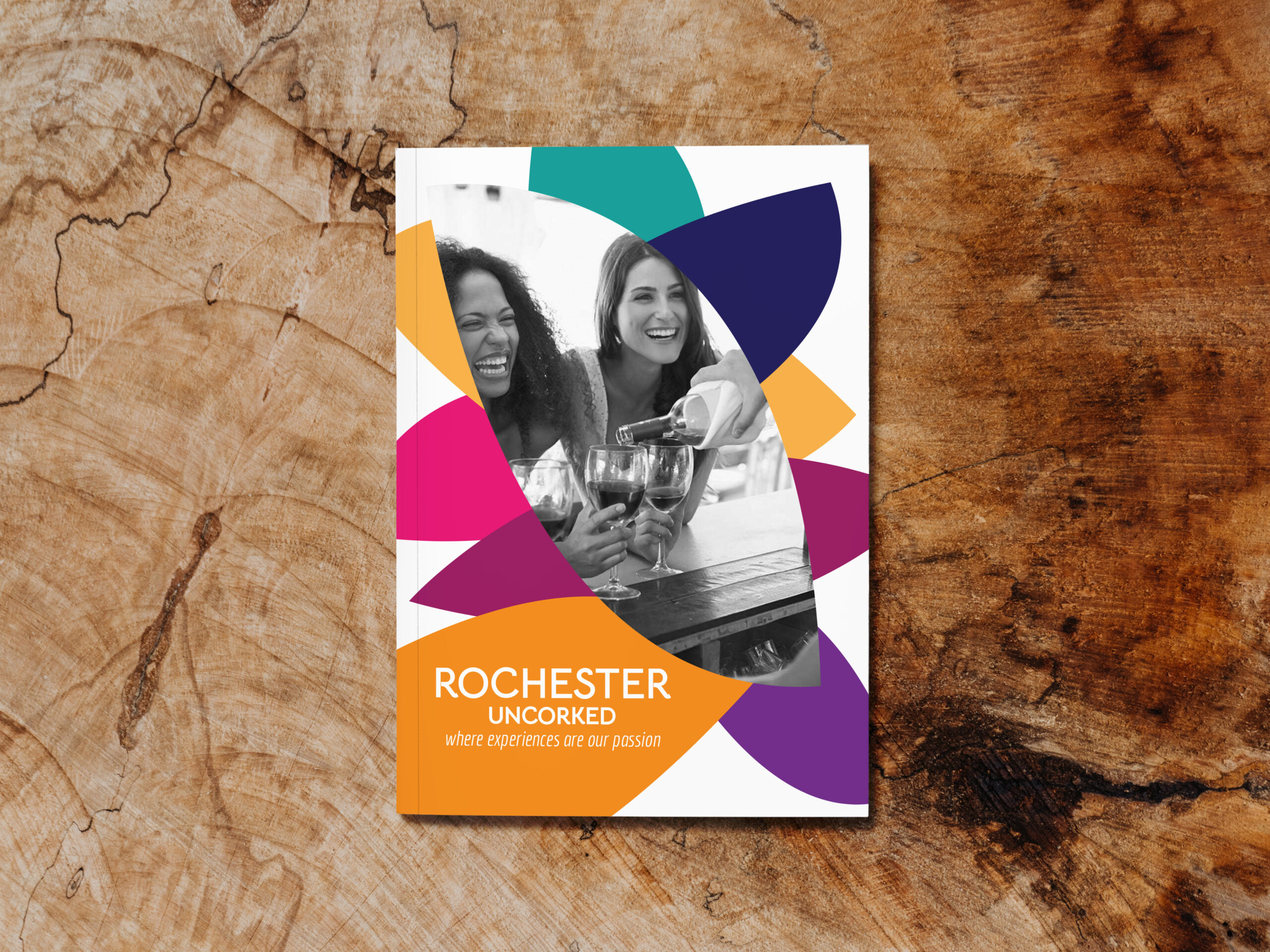
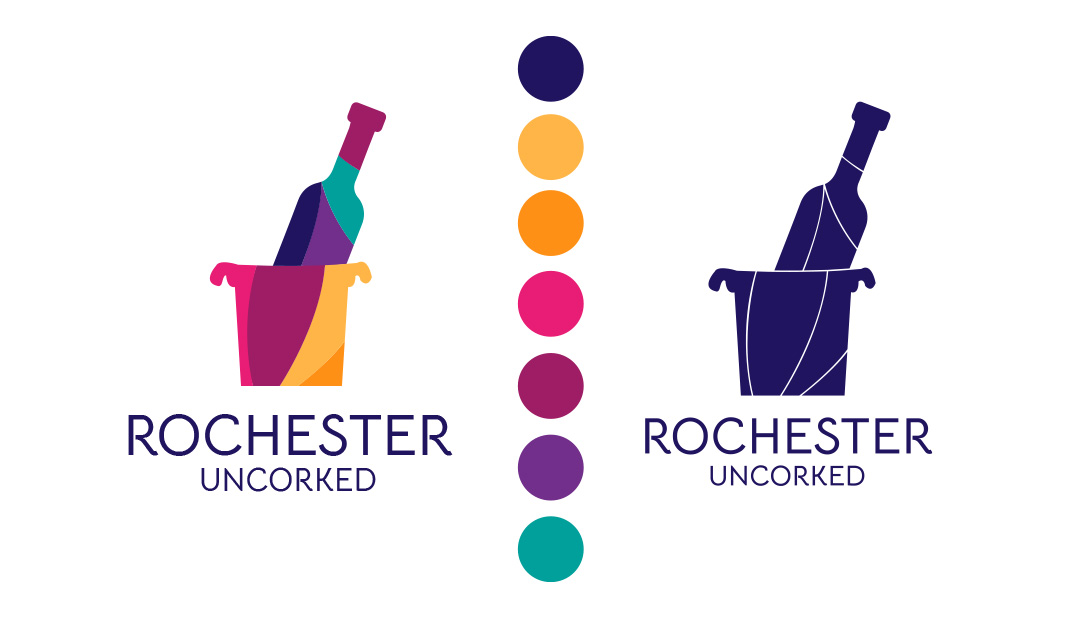
This project was built from the ground up. Tasked with creating a unique logo based on requests from 99designs; I then expanded on that visual language creating a wholly new company complete with finding a building to reinvent, packaging, and print materials.
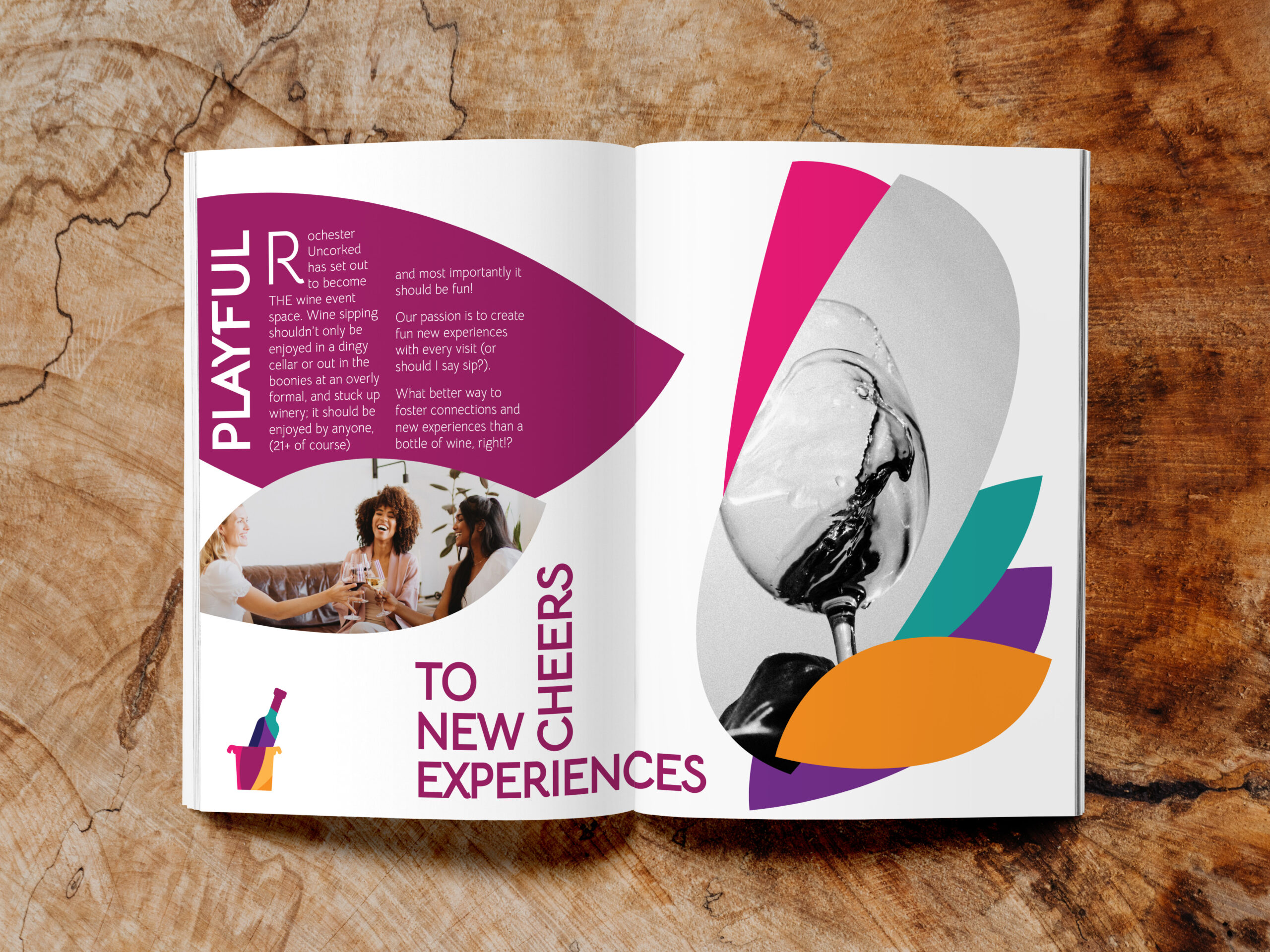
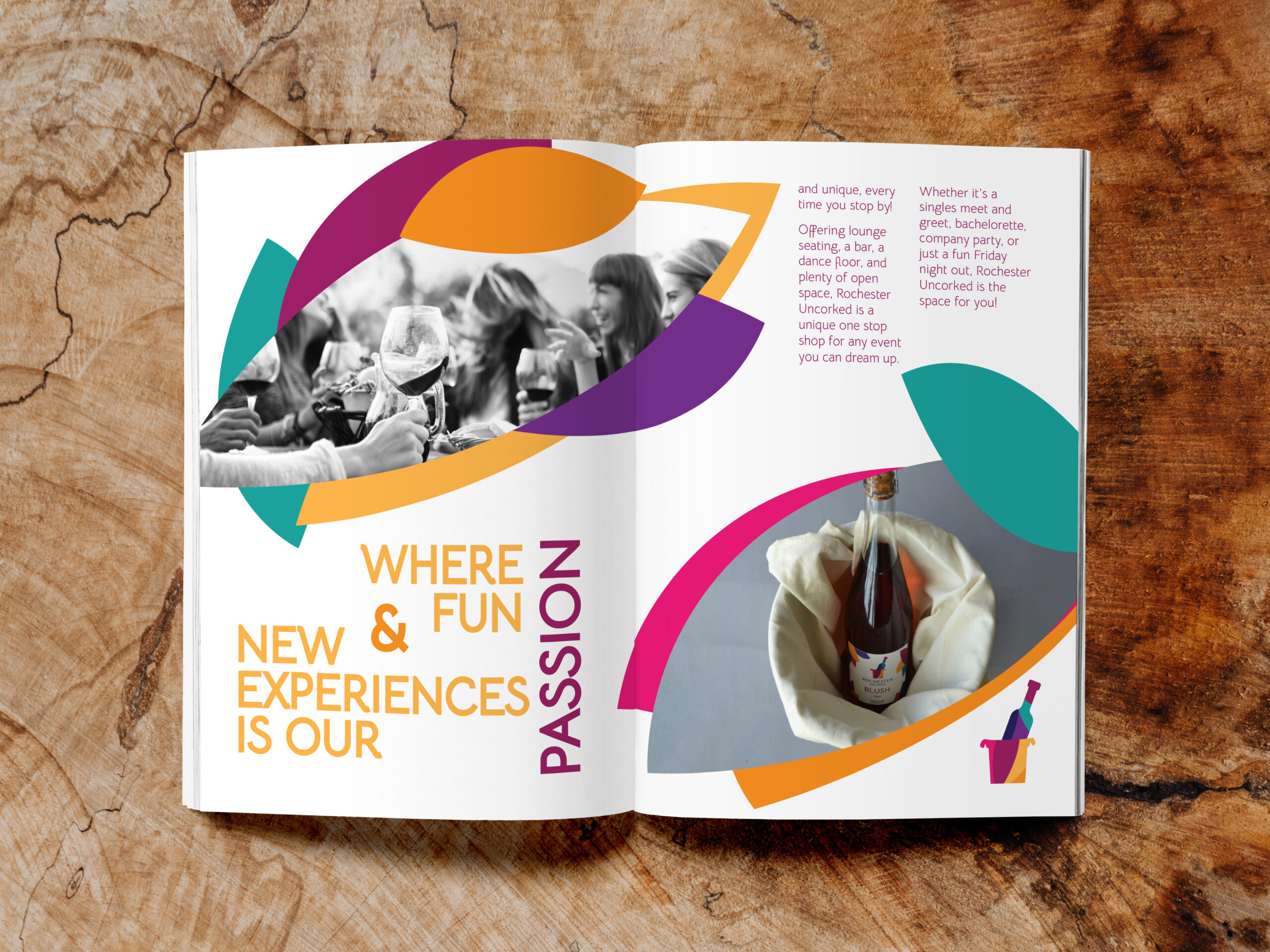
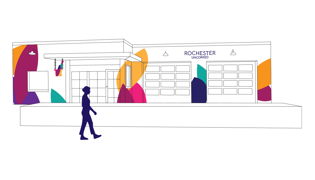
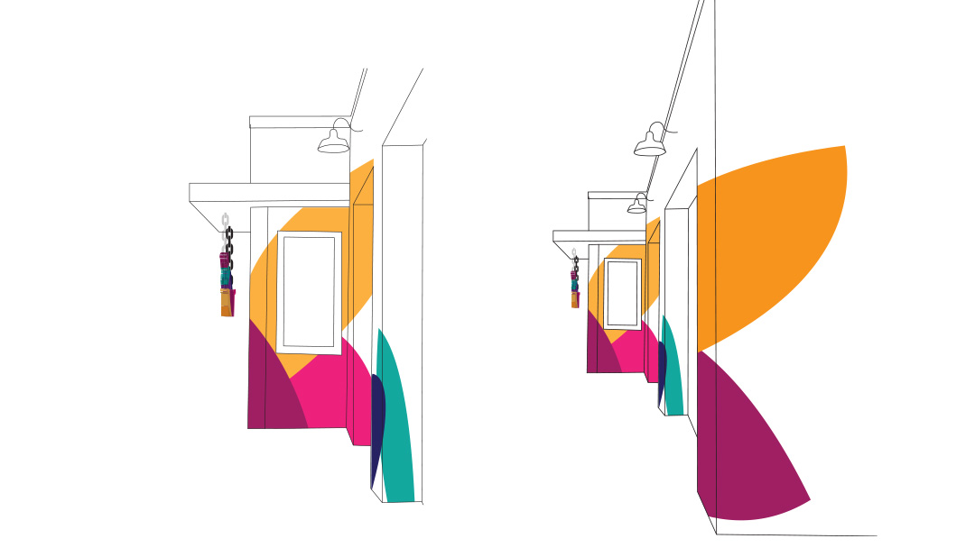
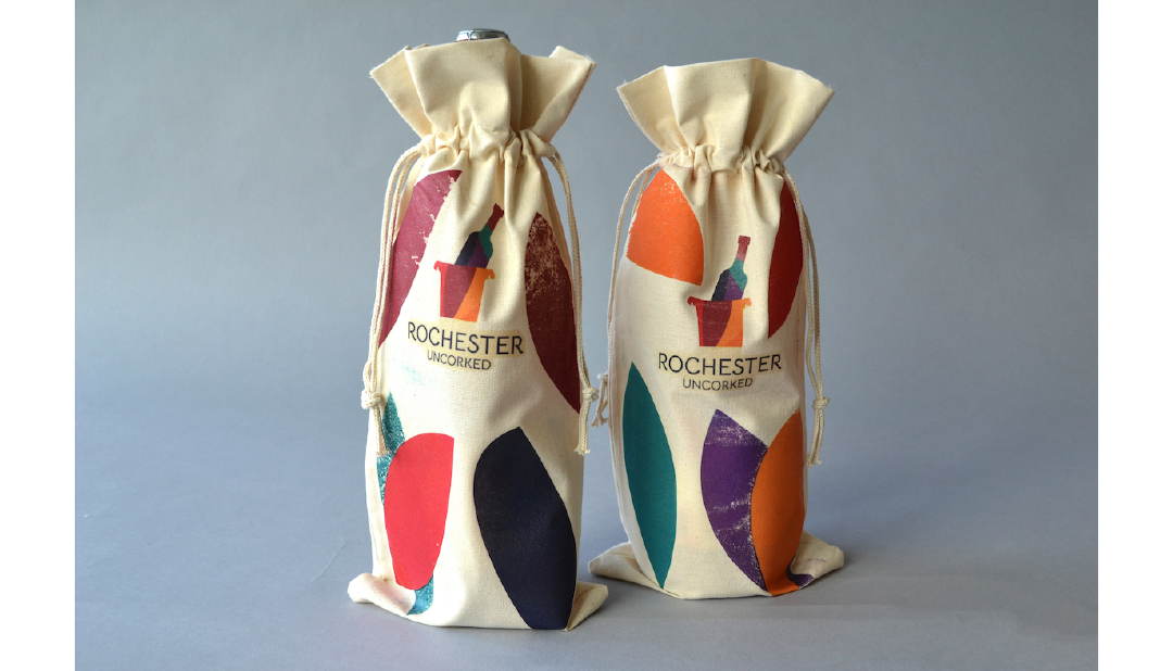
Rochester Uncorked became a fun, vibrant event space intended for the younger generations, far removed from the stuffy vibe of a classic winery. This is reflected in the multitude of colors chosen for the logo, the space itself, the packaging, and the wording used in promotional materials. For the building itself I chose the downtown Boise local, Matlacks to reinvent for the purposes of this project.
Building Design
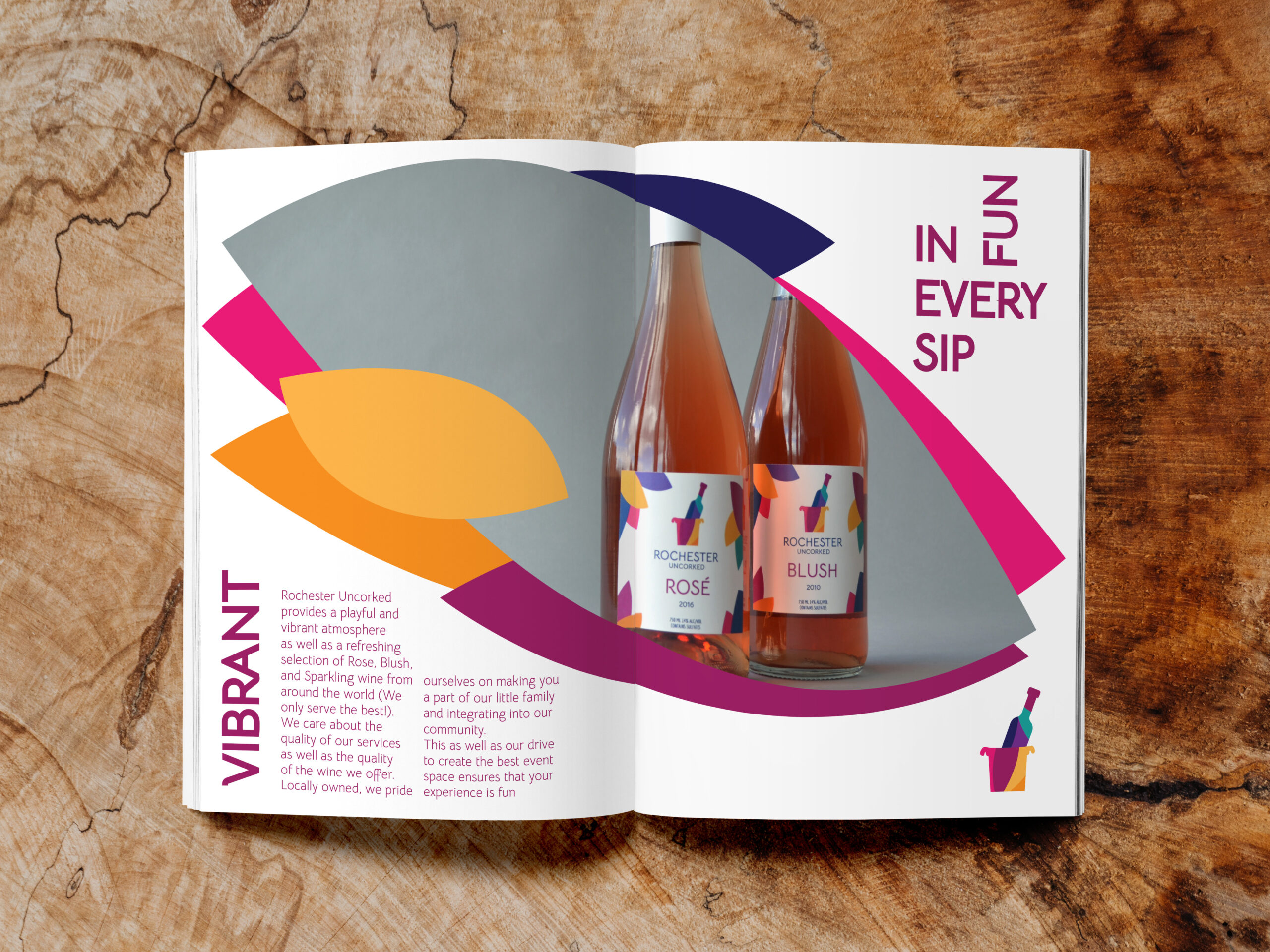
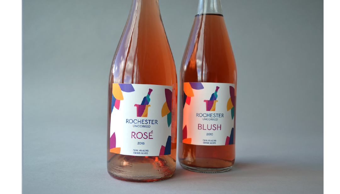
Labels & Packaging
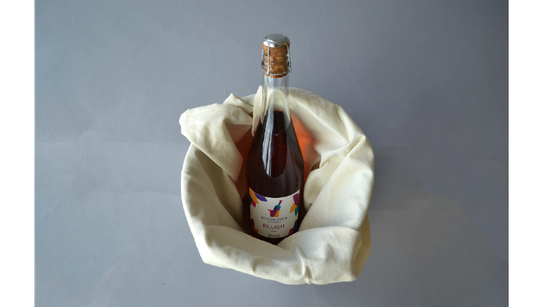
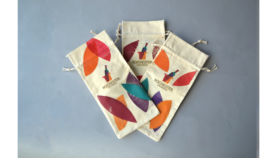
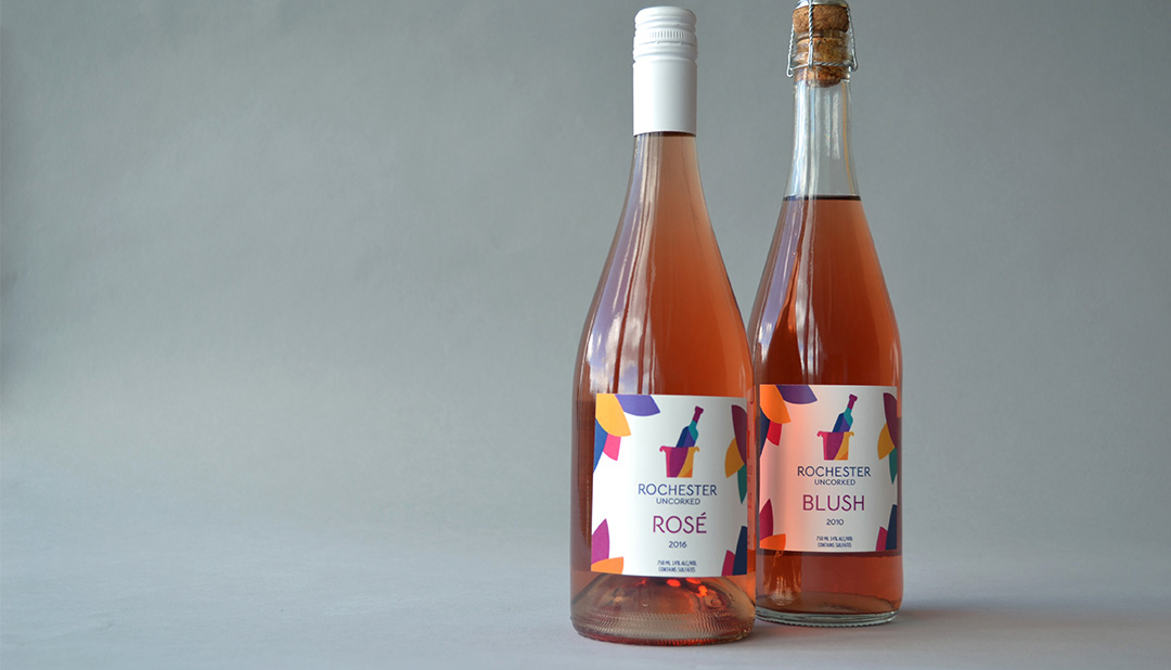
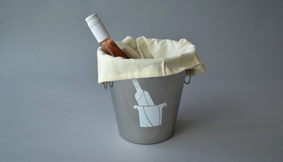
All labels were self printed and the wine bag’s designs were ironed on by me. It was my intention that the company of Rochester Uncorked would have vintages from not too long ago and use goody bags to further instate their core values of youthfulness, fun, and passion.
Print Material
Link to Issuu magazine Here.
