Brand Design
Indarra
Indarra
For this school project I was tasked to make a brand within these very specific parameters, mimicking a real client. I couldn’t make any deviations unless I could convince the ‘client’ to make one.
Name of client and company name: Christian | Visuals associated with the brand: Powerful Waterfalls | Word that describes the company : Comfortable | Industry: Sports | Target Audience Drives: Subaru | Color Pallette: Cool
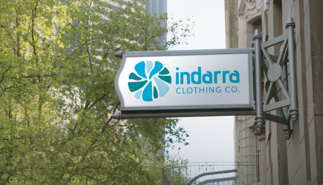
I wanted to create an feminine athletic apparel company similar to Lululemon Athletica. The only change made was to the name. I pitched the name of indarra meaning strength in Basque further emphasizing the visuals assigned. The logo also drew inspirations from waterfalls and the cool color palette, and the name was kept in lowercase to reinforce the feeling of comfort with a feminine touch. I also worked on a short animation for the logo below.
Business Package
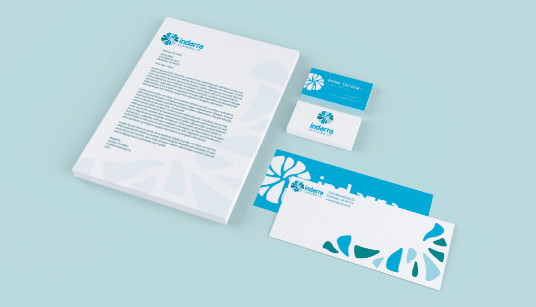
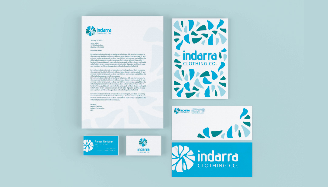
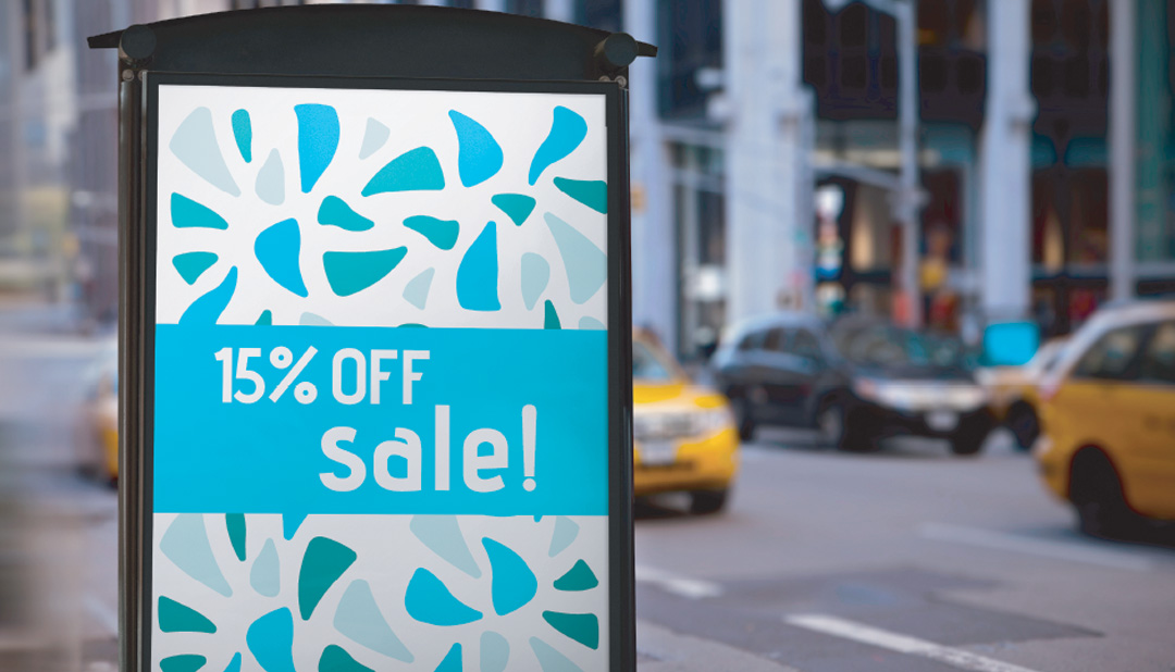
Once the logo was finalized I was able to think about how the brand would develop from there. This was also a chance to showcase the success of the horizontal and single color versions of the logo The business package and signage expanded the overall look and feel of the brand, establishing a visual language that met the requirements given in the beginning of the assignment.
